Agile, Product Management
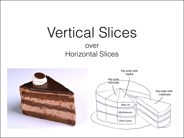
A friend of ours used to joke that the name of this company should be Vertical Slice because of the number of times we’d say it in a given day and how we’re forever having to explain to new people just what it means. It’s an agile term and yes, I know it sounds like we’ve drunk the kool aid – because we have.So, just what is a vertical slice? Well it’s one way of describing a software development practise that can be applied to pretty much anything in life and it boils down to this: rather than developing different pieces of the puzzle in isolation, instead, work on making the smallest possible bit of the puzzle all work together end-to-end first.
For example, if you were making a trifle you would start with a very thin mould (thin slice) where you layer all the ingredients in on top of one another, leave it to set in the fridge immediately (where it sets much quicker because it’s not the full cake), then take it out, test it out and see what it tastes like (the customer response).
There are lots of advantages to developing this way. In the first instance, because you’re making all the layers of the cake work together at the start, you inherently reduce your risk of blowing your deadline by working with technologies that might be difficult to integrate. You identify problems much faster, thereby giving more time in the project for thinking of a solution (rather than the converse which would leave you at the end of the project rushing to make layers work together).
Secondly you get to demonstrate a version of the end feature to your customer much faster, meaning you can learn from their feedback about whether this was what they wanted in the first instance and what you can do to improve the feature based on their actual requirements (not just what you think their requirements are).
Thirdly, it gives you the option to launch the full product faster. You cut out wastage in developing features and functions that are not desired by the customer (no matter how logical they may seem to the feature team) and, if needed, you can launch a solution that makes a date requirement but doesn’t necessarily have all the bells and whistles that originally were envisaged. Meaning you get to market faster than your competitors.
We could go on but you get the idea. Take your requirement and boil it down to the simplest possible variation. For example, if your requirement is that customers can login to your site, and the full version has login across multiple different types of accounts, start by doing login just with Facebook. Don’t style it in your initial story. Boil it back to the basic requirements: – A customer can login from X device, using X browser, via their Facebook credentials This will give you immediate visibility of any technology problems and allow you to pivot your requirement much earlier without having wasted valuable resource on design.
*Vertical slice slide borrowed from Dave Neuman @ Slideshare
0